
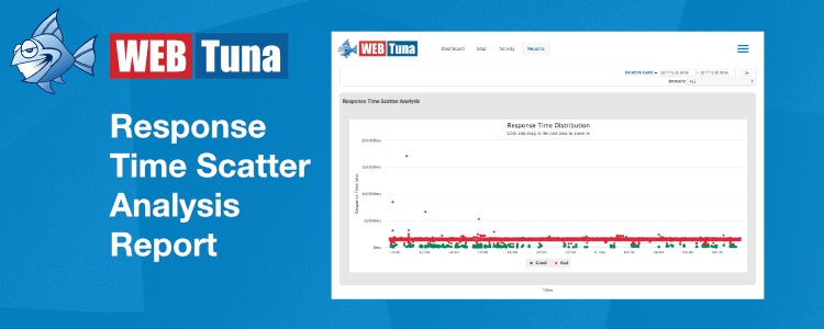
Do you want a quick pictorial overview of how your site is performing? The WebTuna Response Time Scatter Analysis report lets you see your site response time distributions over time.
Last week we looked at the Comparison Report which allows you to compare performance across two separate time periods for a set of domains, which is great for testing a release prior to go-live. The next report that I wanted to take a brief look at is the Response Time Scatter Analysis.
As is common with most of the reports, you have the Domain selector to give you a filtered view of either a single domain, a group of domains or all domains, and the usual time selector.
Note that this report plots every hit on your site for the selected time range. So, please be aware that for busy sites you will need to restrict your time range to a relatively short period, because of the volume of data to be analysed. If you select too long a period, the analysis will time out. Start with small periods, and build up.
The first thing to notice on the displayed report, is that the individual points are colour-coded red or green. These are in accordance with the domain SLA that you have defined. So please see this blog article which outlines the importance of setting the SLA to a realistic value, and keeping it under review, as you make improvments to your site.
It also allows you to see whether you get clusters of poor performance at a given time, which may coincide for example with other operations going on.
Once you have your report, you can drill down into specific time-periods, by clicking and dragging a selector acrosss the chart. This can be useful, as a large volume of red, poor, responses can make it hard to see the green, good, responses, which is a limitation casued by the size of the data points.
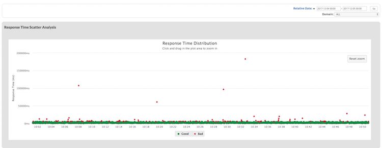
In this view you can see that there are some slow responses, but a very small number of exceptionally slow pages. There is no obvious correlation at this view.
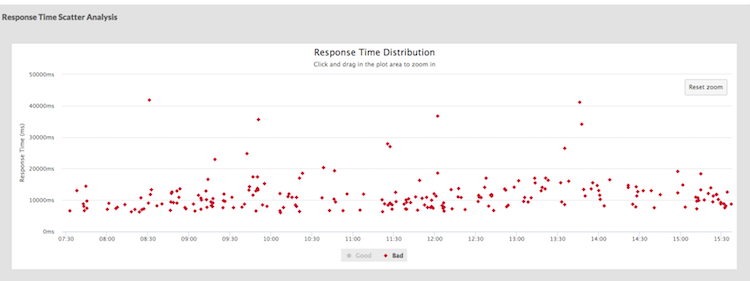
If you select ‘good’ or ‘bad’ in the legend, then that will hide/show just the selected set of data points. This next view is showing just the bad responses.
If you’ve never looked at this report, why not check it out occasionally – it’s great for getting a quick view of how many page views are abnormally slow, and when they occur. Or if you are new to WebTuna, why not signup for a 15 day free trial.